Elephaid Foundation — Donation Experience
Role: UX Designer | Timeline: Jan 2025 – Apr 2025 | Tools: Adobe XD, Figma
Project Overview
Elephaid is a mobile app that supports elephant conservation through education, donations, and community involvement. Despite strong emotional engagement from users, the app struggled with low donation conversion due to a confusing and impersonal donation flow.

Problem Statement:
Research & insights:
App supports elephant conservation through education, donations, and community involvement.
Despite emotional engagement, < 8% of users completed donations.
Users reported frustration with unclear steps, lack of confirmation, and limited transparency — especially when emotionally motivated to give.
User research revealed low trust and confusing flows disrupt donors at key moments.
Common pain points: unclear steps, lack of progress feedback, and weak impact messaging.
Synthesized insights into clear UX goals: streamline donation flow, improve trust signals, and boost emotional engagement.
Design Process:
User Flows & Personas: Defined primary donor journeys and motivations.
Wireframing & Prototyping: Created low‑ and mid‑fidelity screens to ideate donation paths and hierarchy.
Usability Testing: Tested early prototypes; iterated based on confusion points and drop‑off areas.
Final UI Design: Applied trust‑building elements (confirmation screens, impact cues, transparent steps) and consistent visual hierarchy.
Outcome & Learning:
Redesigned donations flow simplified steps and improved clarity.
Added clear confirmations and impact indicators to strengthen emotional engagement.
Usability tests showed higher confidence and fewer points of hesitation in the donation process.
Hypothetical impact: A more intuitive flow and better trust signals aim to raise donation completion beyond ~8%.
Original Client Prototype:
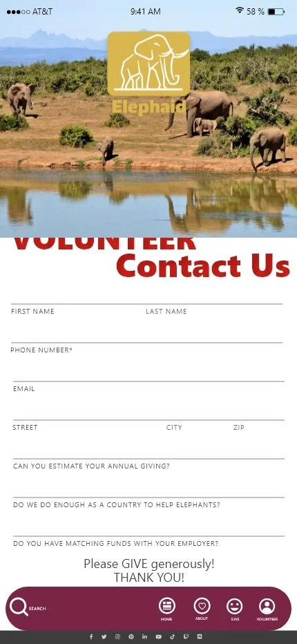
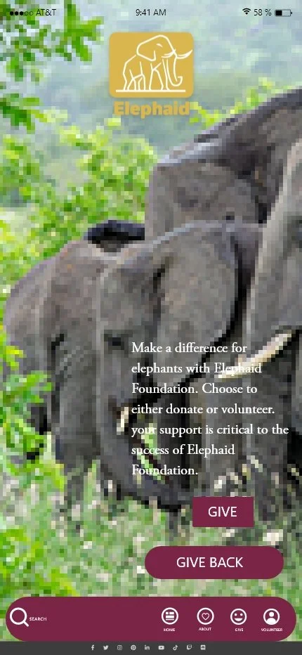
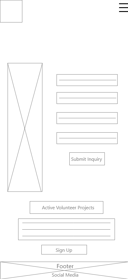

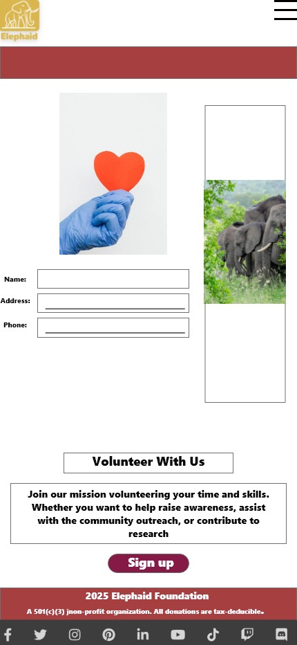
Original donation flow with unclear steps and low trust signals causing friction and drop‑off.
Unstructured screens and inconsistent feedback hindered user confidence and completion
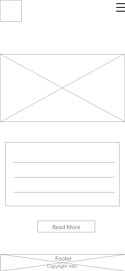
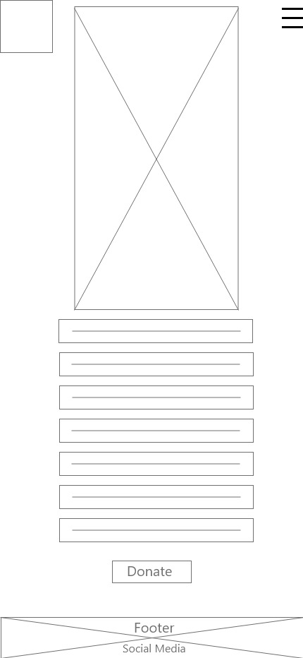
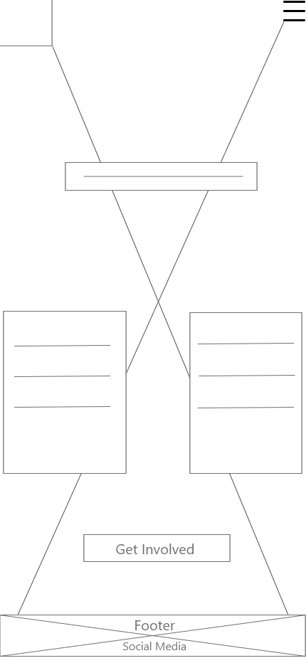
Low Fidelity Wireframes:
Mapped improved donation flow with clearer task hierarchy and feedback steps.
Explored simplified navigation and CTA placement to increase clarity.
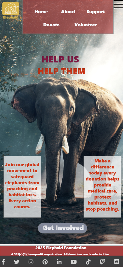
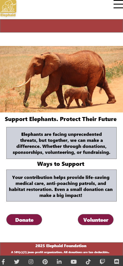
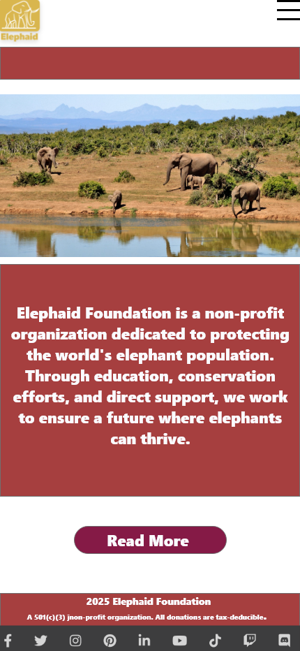
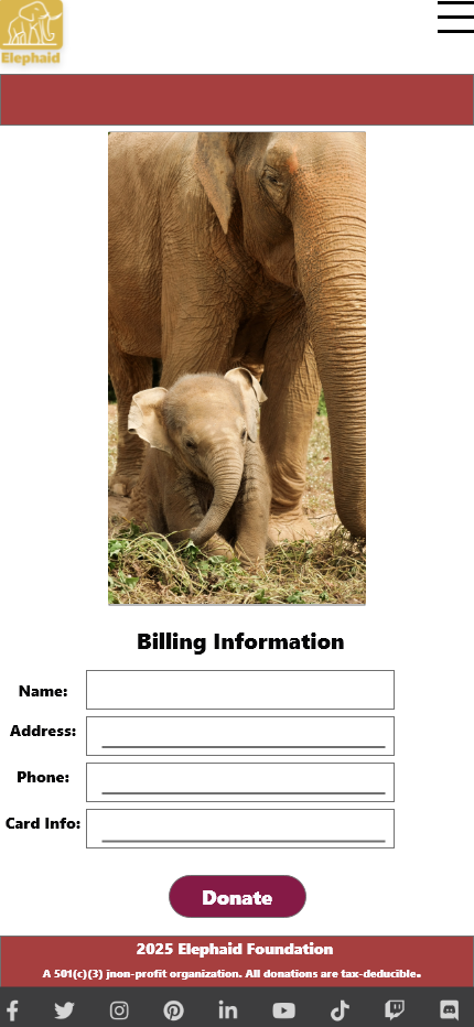
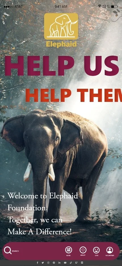
Final UI- Key Screens:
Clean, modern interface designed to guide users smoothly through donation steps.
Clear CTA placement and feedback indicators to boost trust and task completion.
Visual hierarchy and emotion‑focused imagery strengthen engagement with the cause.
Simplified form layout reduces cognitive load and supports confidence in giving.
Reflection:
Strengthened my UX research and iteration skills by connecting insights directly to design decisions.
Learned how trust cues and feedback are crucial in high‑emotion experiences like donations.
Future improvements: broaden testing with diverse users and incorporate metrics to quantify impact