Fresh Fare Farms — Multi-Channel Advertising Campaign
Role: UX Designer | Timeline: March 2025 – June 2025 | Tools: Adobe XD, Figma, Adobe Illustrator
Project Overview:
Fresh Fare Farms is a meal delivery service centered on locally sourced ingredients and sustainable farming practices. For this academic project, the objective was to design a cohesive multi-channel advertising campaign that increases brand awareness, appeals to younger audiences, and highlights the company’s commitment to fighting food insecurity through its Hunger Action Month initiative
Problem Statement:
Research & insights
Young adults (ages 21–35) want healthy, ethical food options but often lack time for cooking or grocery shopping. At the same time, socially conscious consumers want to support meaningful causes without friction. The existing messaging and campaign structure did not clearly connect consumer motivation to the brand’s mission or incentivize sign-ups.
Based on competitor review, audience analysis, and values exploration:
Young professionals value sustainability, simplicity, and brands with purpose.
Social impact messaging motivates sign-ups when directly tied to user action.
Scannability matters: Short, imagery-driven content improves immediate comprehension for busy users.
Design Process:
1. Consistent Visual Identity Across Channels
Maintained unified visual language (color, type, imagery) across print, social, and digital ads to build brand recognition and trust.
Why this matters: Consistency increases recall and reduces cognitive load when users encounter the campaign on multiple platforms.
2. Short, Scannable Messaging
Simplified content to focus on core value propositions: sustainability, convenience, and community impact.
Why this matters: Target users are time-pressed; concise messaging improves comprehension and engagement.
3. Inclusive & Purpose-Driven Visuals
Imagery reflects diverse audiences and highlights both product and mission elements (e.g., food, local farms, community engagement).
Why this matters: Aligning visuals with user values strengthens emotional connection and supports conversion.
Campaign Concepts:
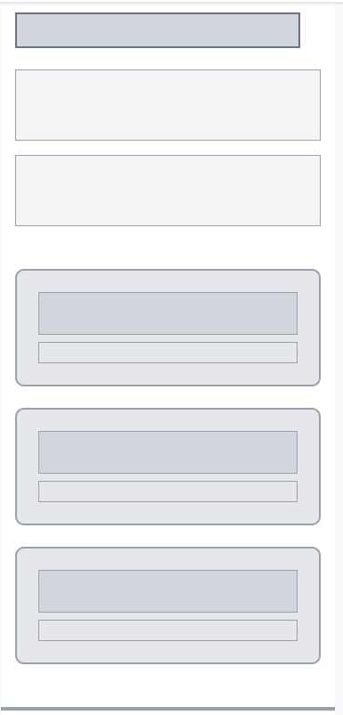
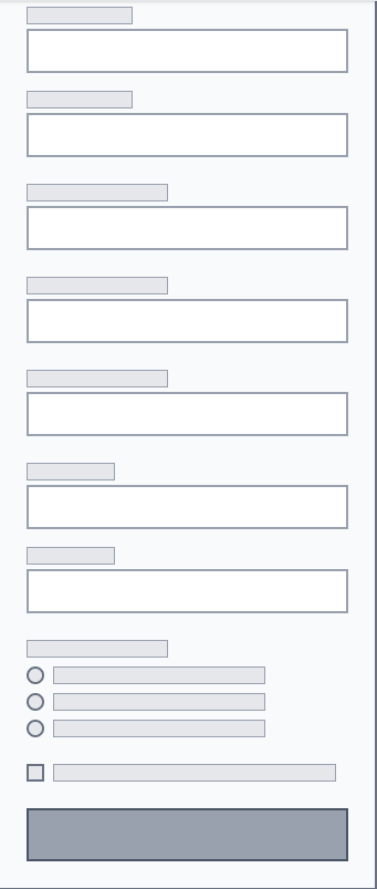
Low Fidelity Wireframes (Desktop/Mobile)
Early wireframes focused on simplifying layout, prioritizing key campaign messaging, and mapping a logical progression from awareness to sign-up — guiding users through the experience before visual styling was applied.
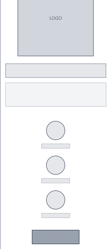
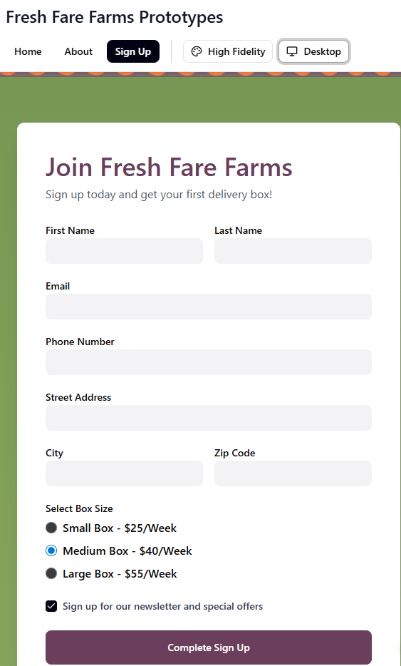
Final UI (Desktop/Mobile)
The final design introduces stronger visual hierarchy, clearer section grouping, and simplified messaging to create a more engaging and conversion-focused campaign experience.
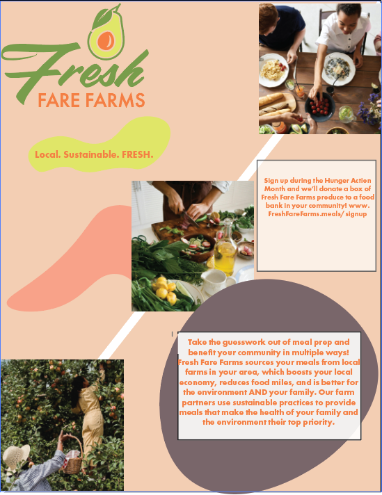
Print Ad Design
Consistent branding with mission message and simple value points to reinforce purpose.


Reflection:
This project reinforced that clarity and emotional connection drive engagement in purpose-driven campaigns. Focusing design decisions on user motivation and values — rather than pure aesthetics — helps align product messaging with real human needs.
Key takeaways:
A unified visual system strengthens cross-channel engagement.
Short, benefit-driven content improves scan ability for busy users.
Purpose-driven messaging should always be tied to direct user actions.
If expanded further, I would validate these concepts with user testing to refine messaging effectiveness and explore A/B variations for CTA performance