FutureFunds – Landing Page Design
Role: UX Designer | Timeline: Jan 2025 – Apr 2025 | Tools: Adobe XD, Figma
Project Overview:
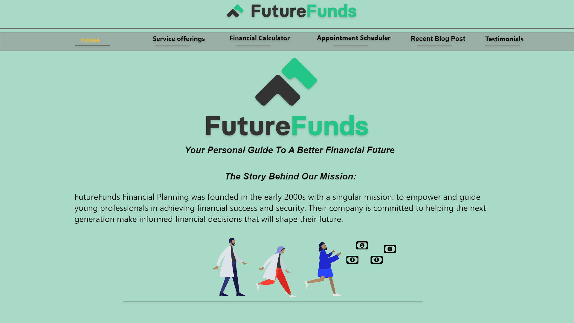
Designed a landing page for young professionals to increase engagement with financial planning services.
Goal: Simplify the user journey, reduce friction, and boost conversions.
Problem Statement:
Research & Insights:
Young professionals felt overwhelmed by financial planning due to complex language and unclear next steps. This led to low trust and high bounce rates on the landing page.
Target audience: young professionals seeking financial planning guidance
Pain points: confusing donation/conversion flows, unclear task hierarchy
Users wanted quick access to top tasks and trust-building signals
Insights → UX goals: simplify flows, clarify hierarchy, enhance readability
Design Process:
Wireframing: mapped key flows and hierarchy
Mid-fidelity prototypes: refined layout, navigation, CTAs
Usability testing: 5 participants; iterated on friction points
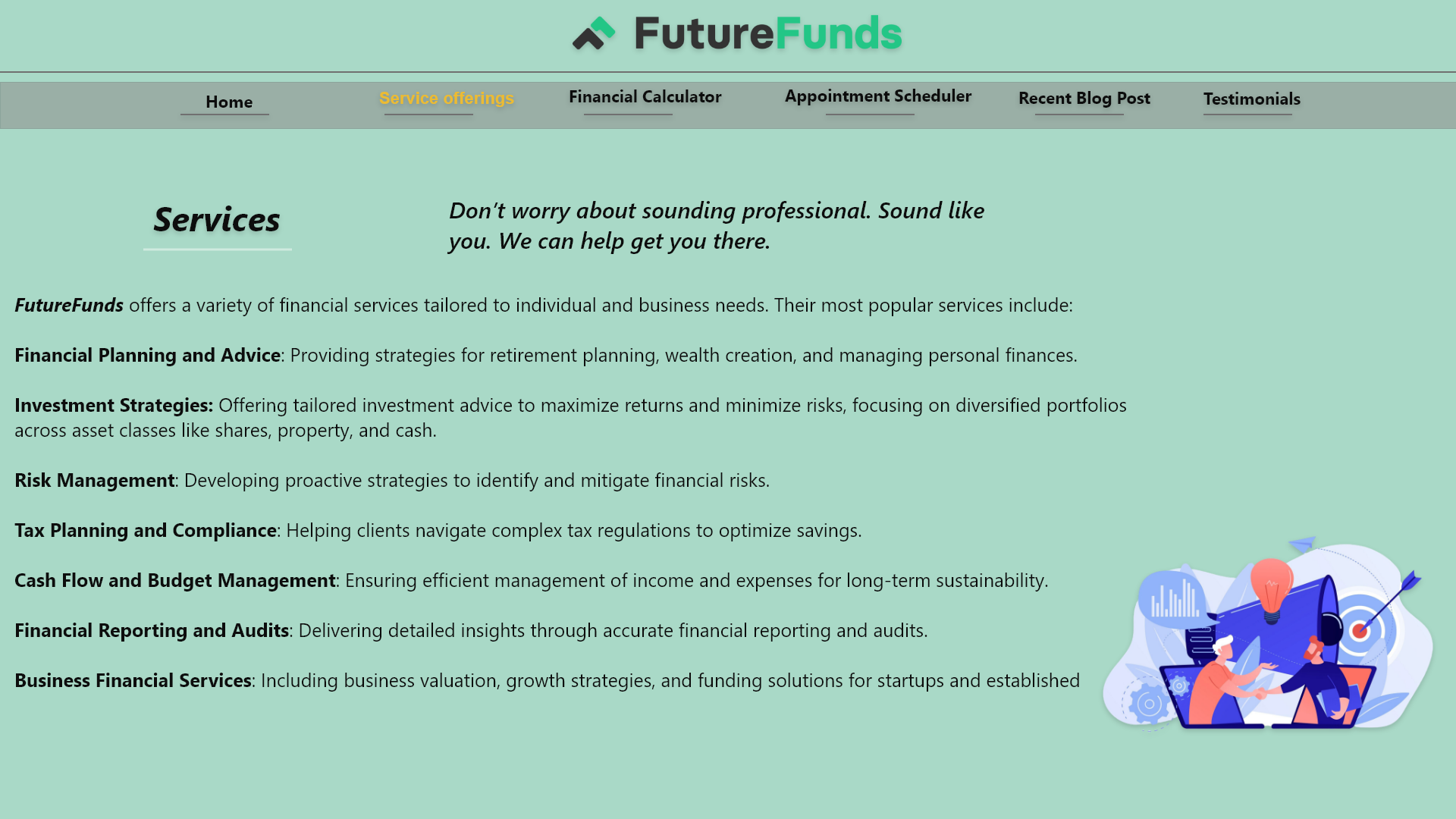
Final UI: consistent typography, color palette, imagery for trust
Outcome & Learning:
Improved clarity, usability, and overall user experience.
Strengthened skills in wireframing, prototyping, and rapid iteration.
Learned to make design decisions that balance user needs with business goals.

Wireframes → Mid-fidelity screens → Final UI mockups.
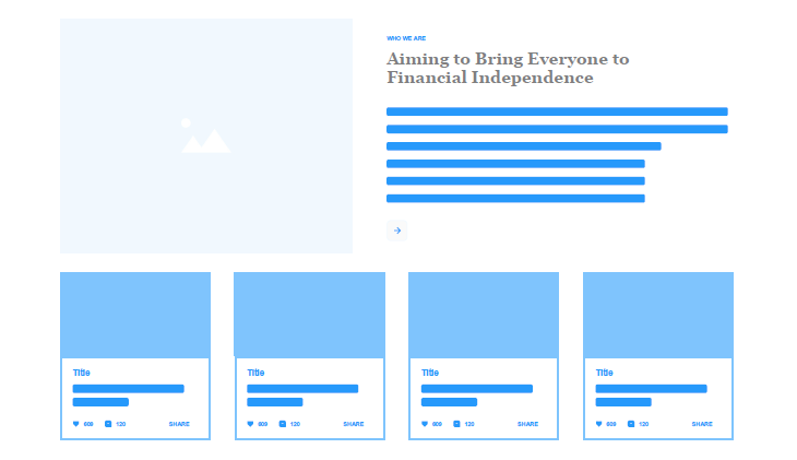
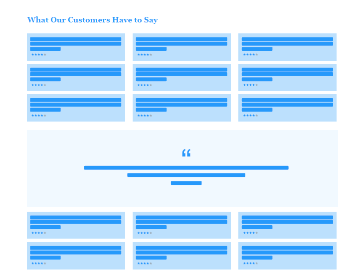
Original Experience:
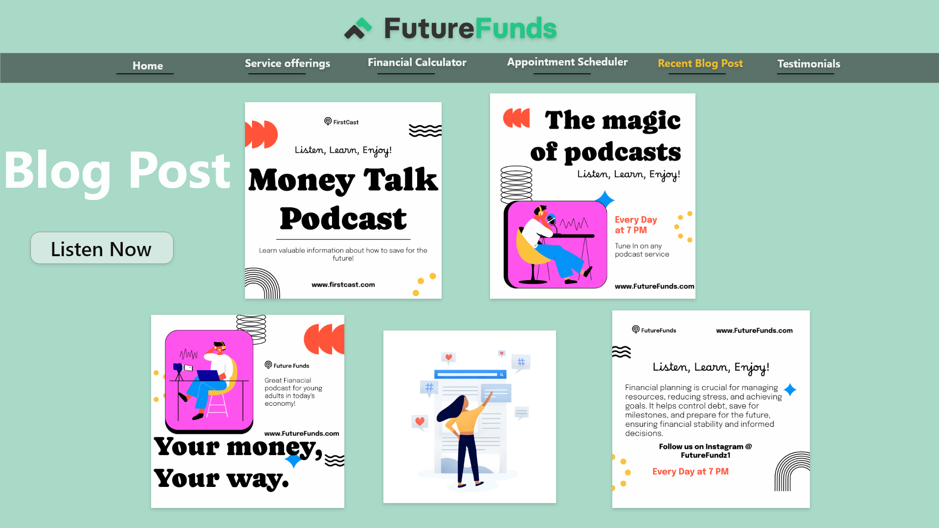
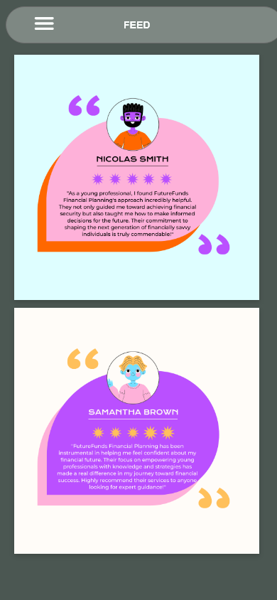
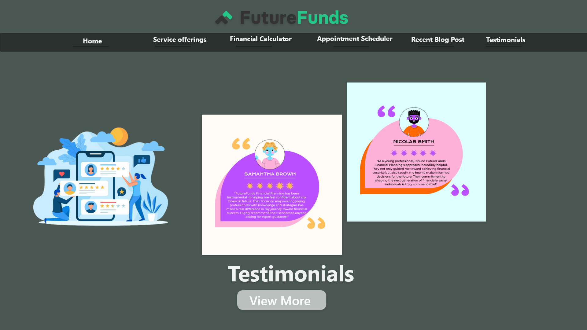
Testimonial sections were repeated excessively, creating visual fatigue.
No clear prioritization of value proposition above the fold.
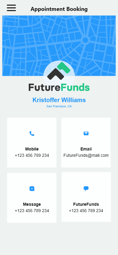
Appointment booking section competed with other content blocks.
Trust elements were buried instead of strategically surfaced.
Visual rhythm lacked hierarchy, reducing scan efficiency.
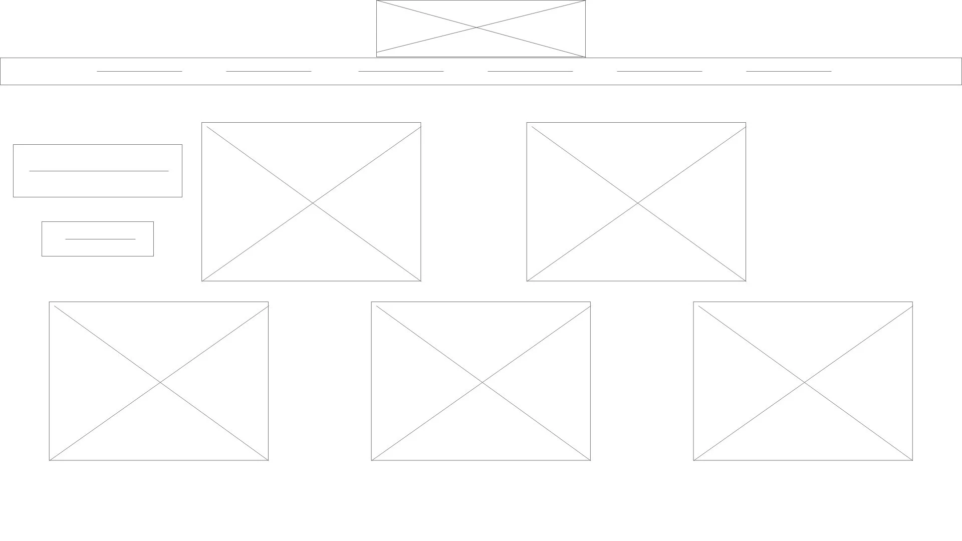
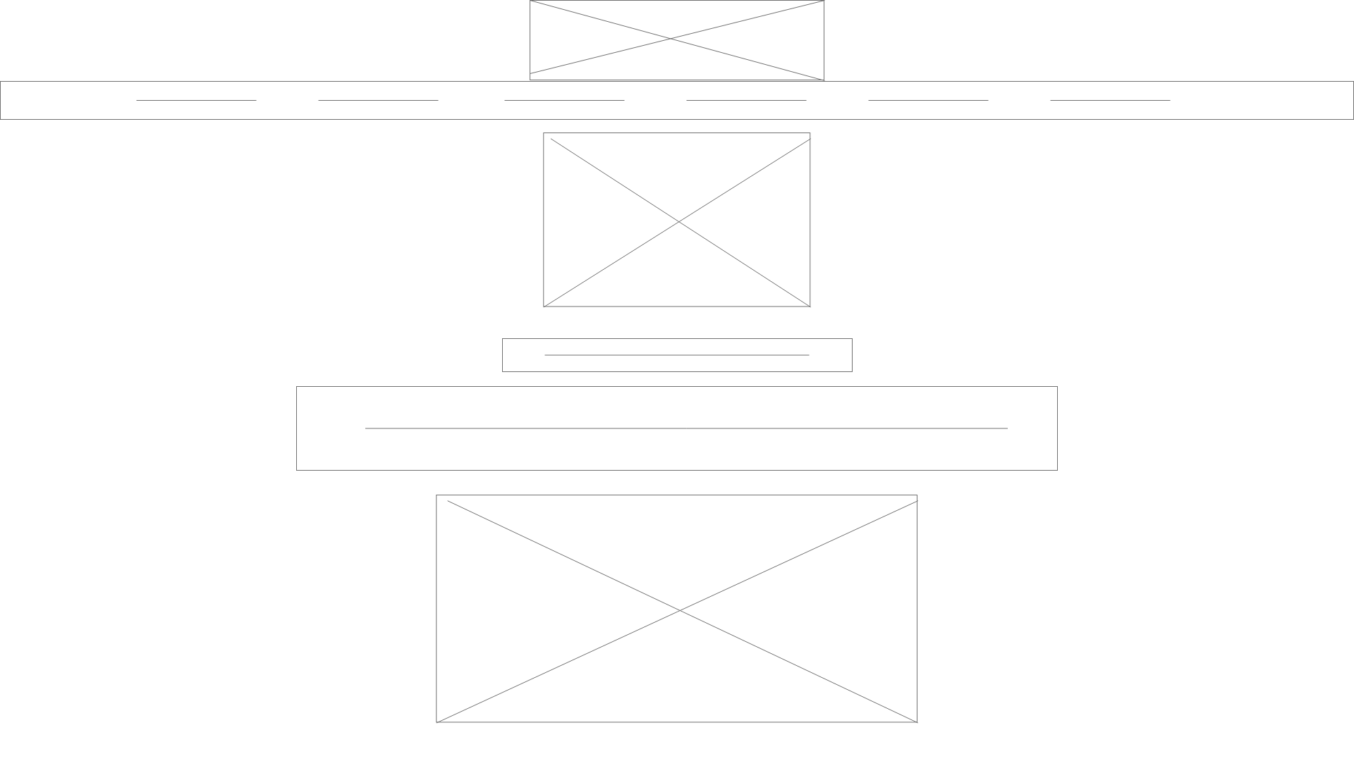
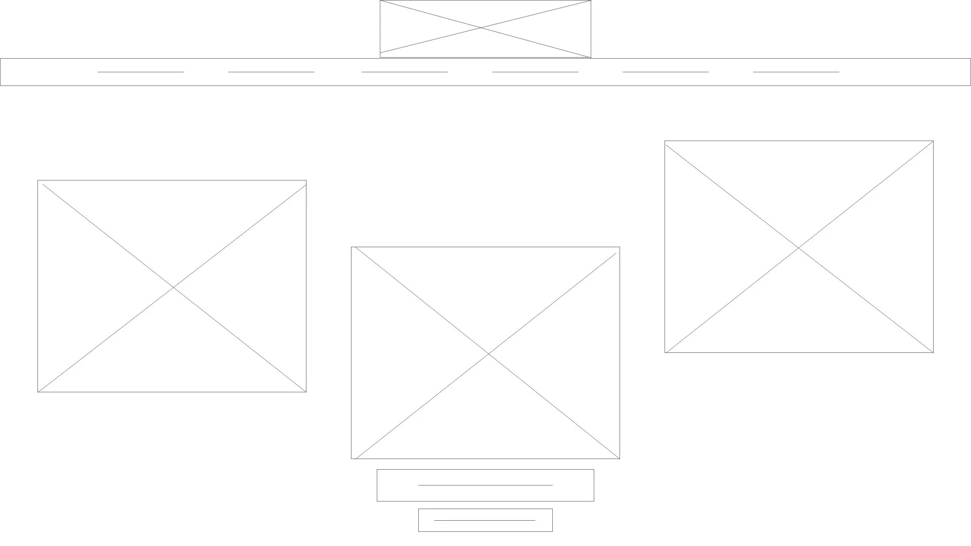
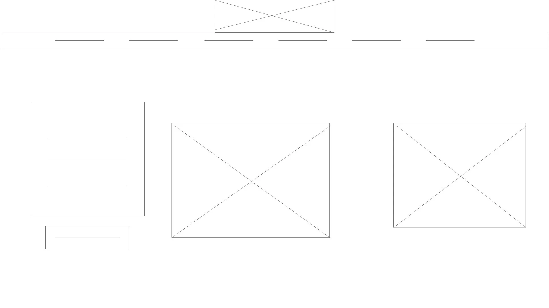
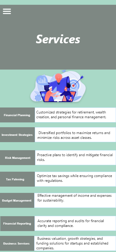
Low-Fidelity Wireframes
Cleaner sectional grouping
Reduced redundancy
More intentional layout spacing
Clear hero structure
Defined content blocks
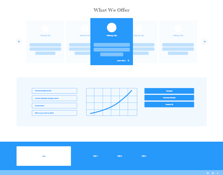
Reorganized the layout to establish clearer hierarchy.
Reduced testimonial repetition to decrease cognitive overload.
Grouped related content into distinct visual sections.
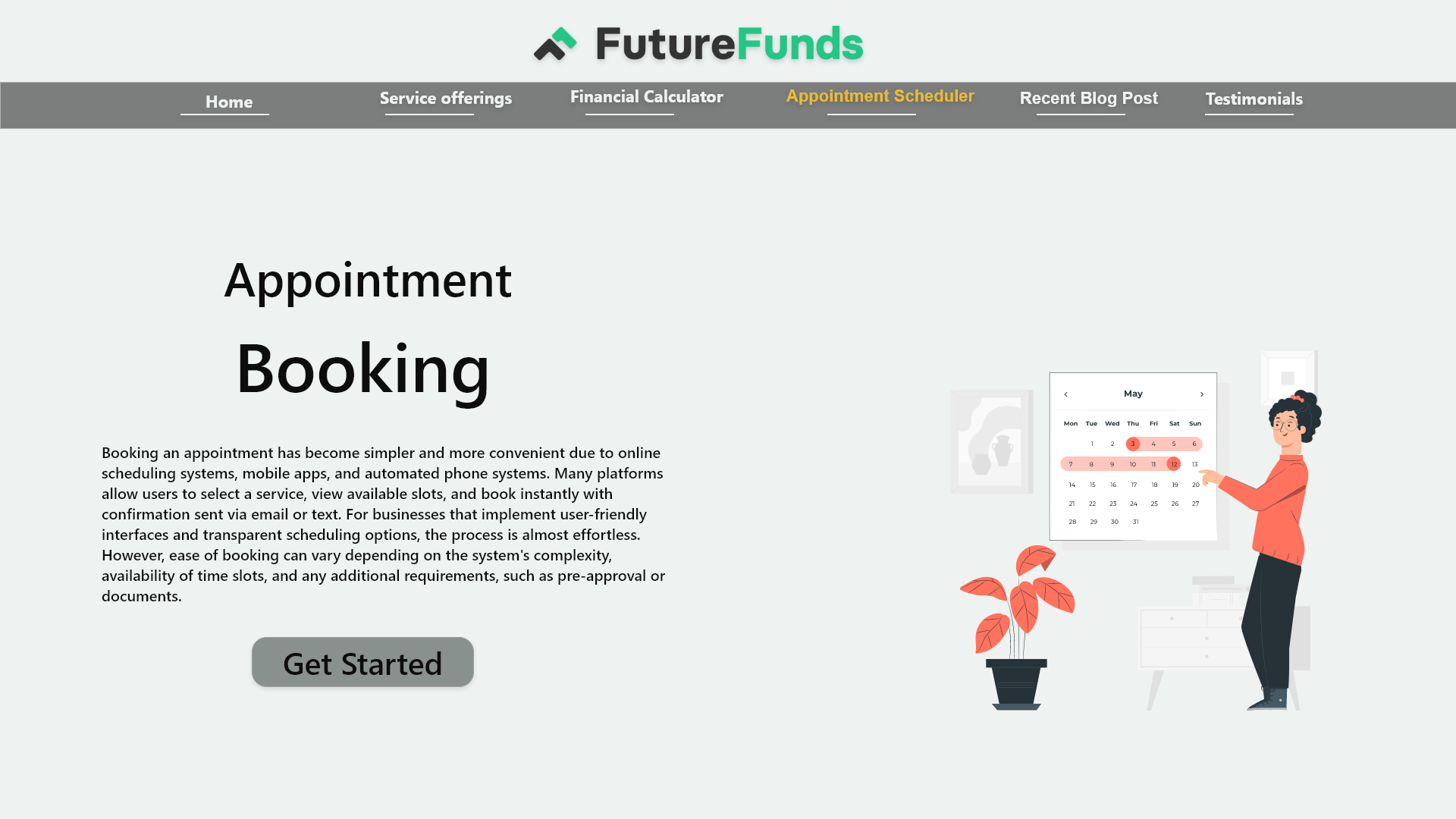
Elevated the primary CTA placement within the flow.
Focused on scannable content blocks for better readability.
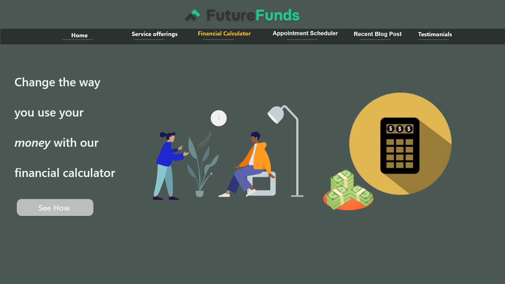
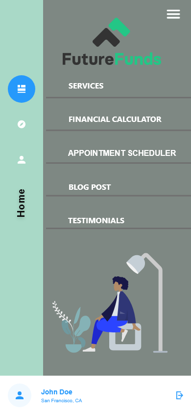
Final UI Designs – Highlights
Clean, modern interface focused on usability and engagement.
Clear hierarchy and intuitive flows to guide users seamlessly.
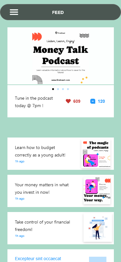
Mobile-first design optimized for readability and interaction.
Refined based on user feedback to improve clarity and conversions.
Reflection
This project strengthened my ability to balance usability with visual design, ensuring interfaces are intuitive and engaging. Iterating based on user feedback taught me to improve flows quickly. I also honed my skills in communicating design decisions while deepening my user-first mindset.
Next steps:
Validate the new designs with more user testing and measure engagement metrics in a live prototype.